
A fashion store
built for the drop.
WhyClub is a streetwear store with a clear point of view. We shaped the brand, the images, and the shopping experience from start to finish.
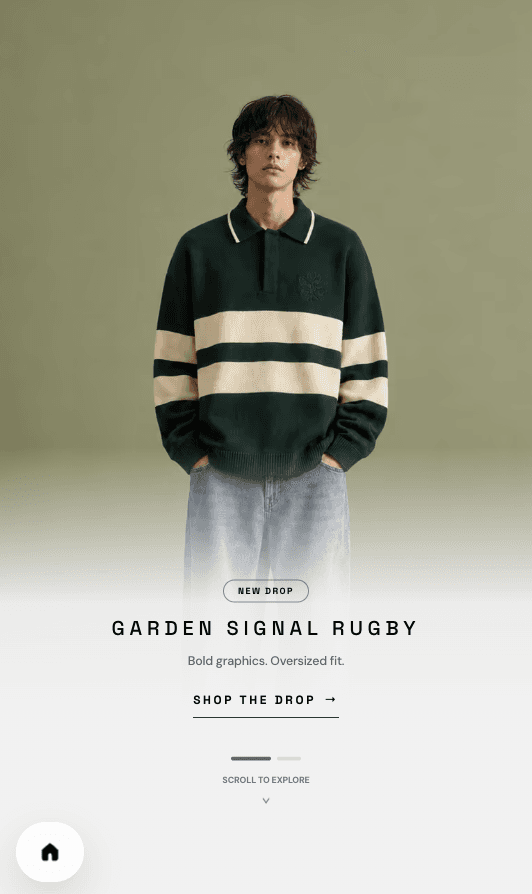
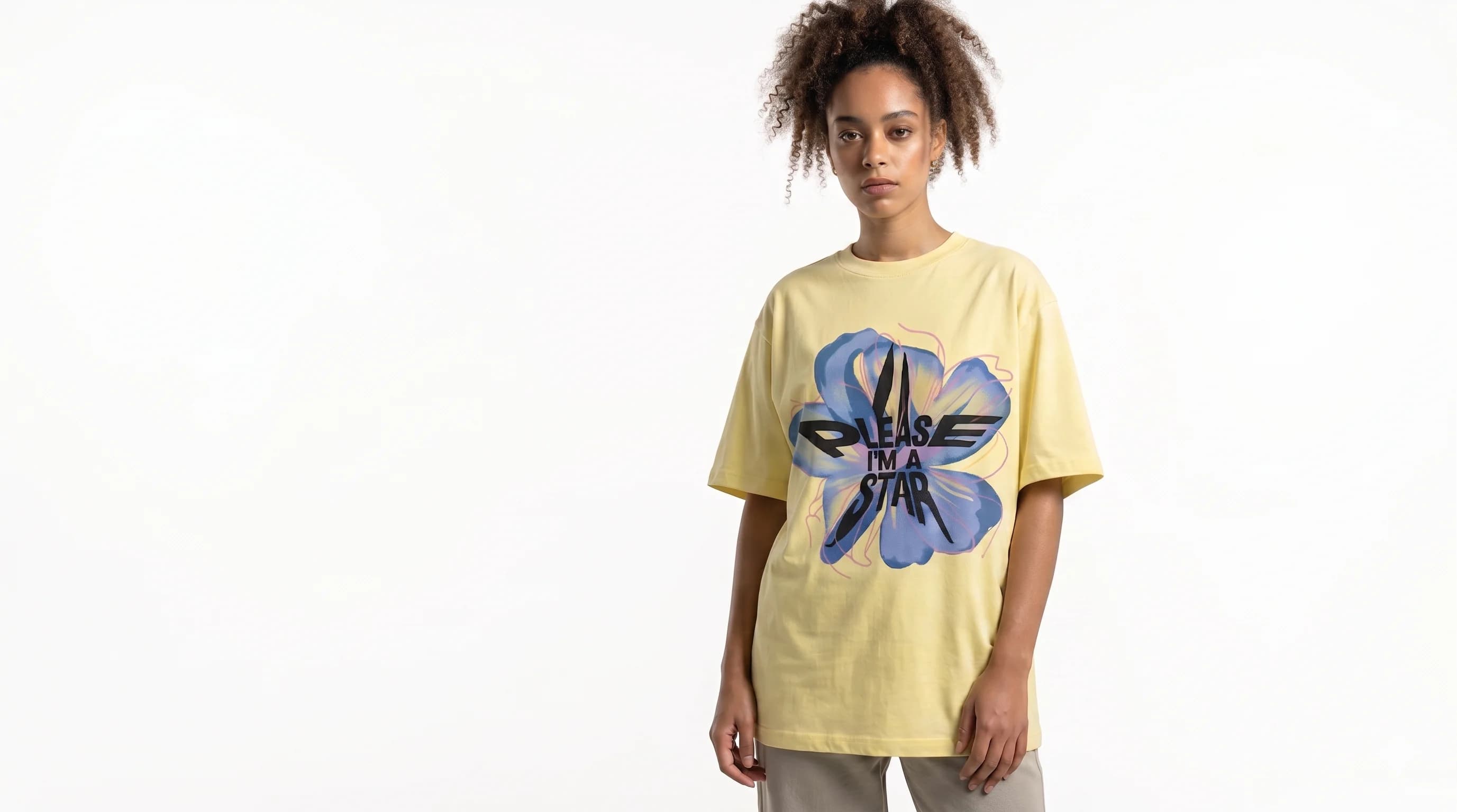
One studio. Every layer.
The work started with a name and a visual voice. It continued through product images, user flows, and the tools the team uses to run each drop.
- Brand
- Identity and art direction
- Experience
- Mobile-first commerce
- Build
- Storefront, checkout, admin
A clear system for a loud brand.
WhyClub needed a visual language that could carry a campaign and a product page. Soft neutrals give the graphic work and clothing room to stand out.
Clear type.
Loud graphics.
The store stays quiet so the clothes, art, and photography can speak first.
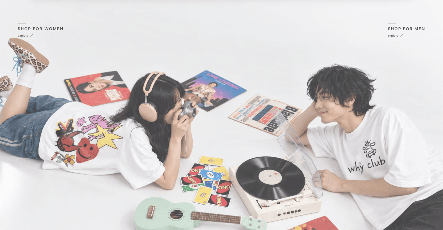
Mobile comes first.
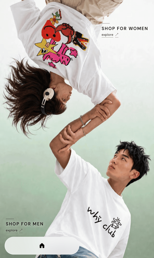
The mobile store puts the campaign, the product, and the next action in clear view. It feels familiar to shop and still feels like WhyClub.
Designed for the hand, not a smaller desktop.
On mobile, the campaign image, the next action, and the product path stay easy to read. The layout keeps familiar store patterns without losing WhyClub's character.
- 01 / Campaign-led
- The first screen gives the image room to lead.
- 02 / Easy to shop
- Key actions stay close to the thumb.
- 03 / One system
- Type, colour, and motion stay consistent across the store.
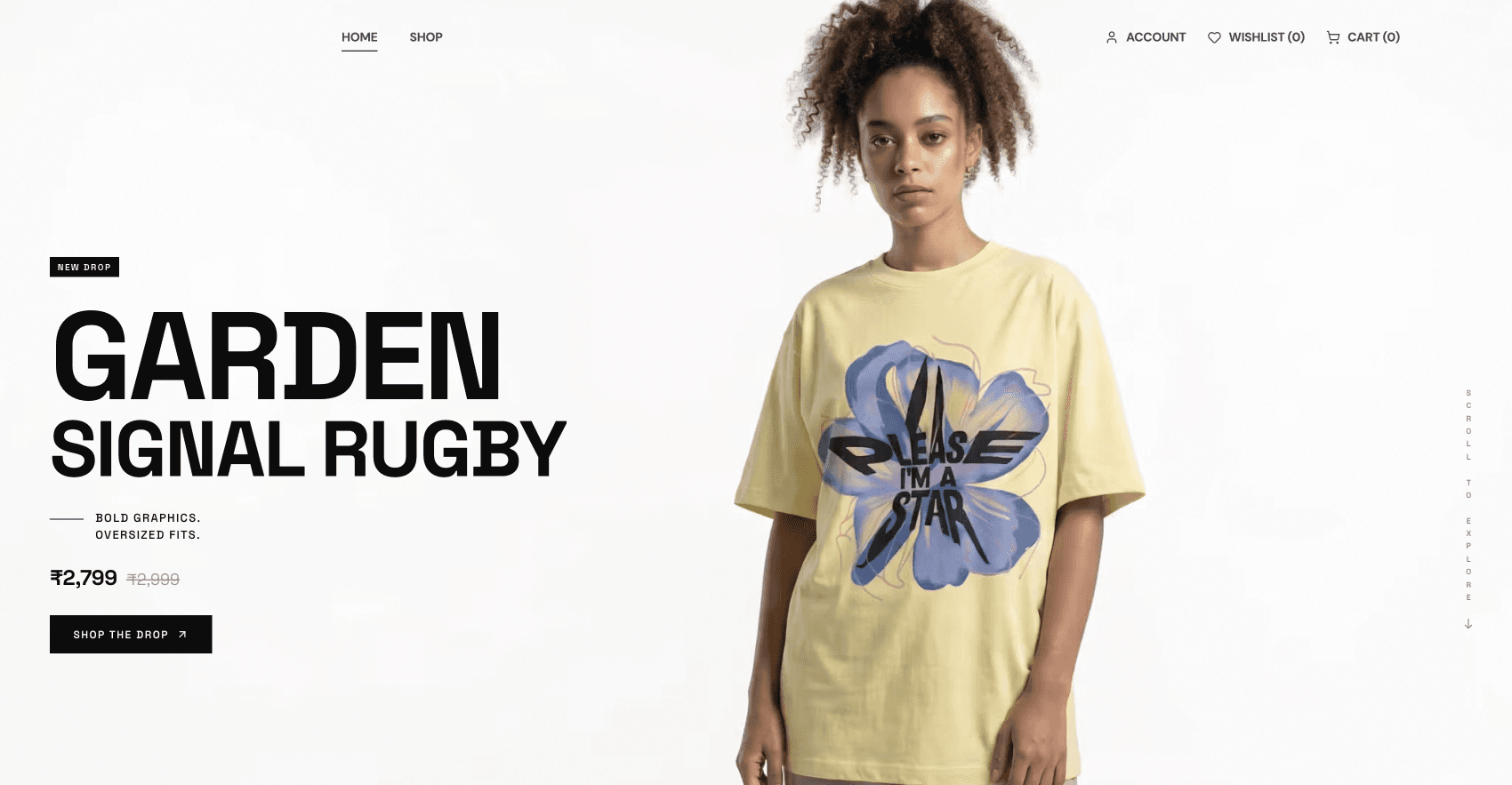
One brand, two useful views.
Desktop gives the campaign space to breathe. Mobile makes browsing fast and easy. The same type, colour, and product logic connect both.
From campaign image to checkout.
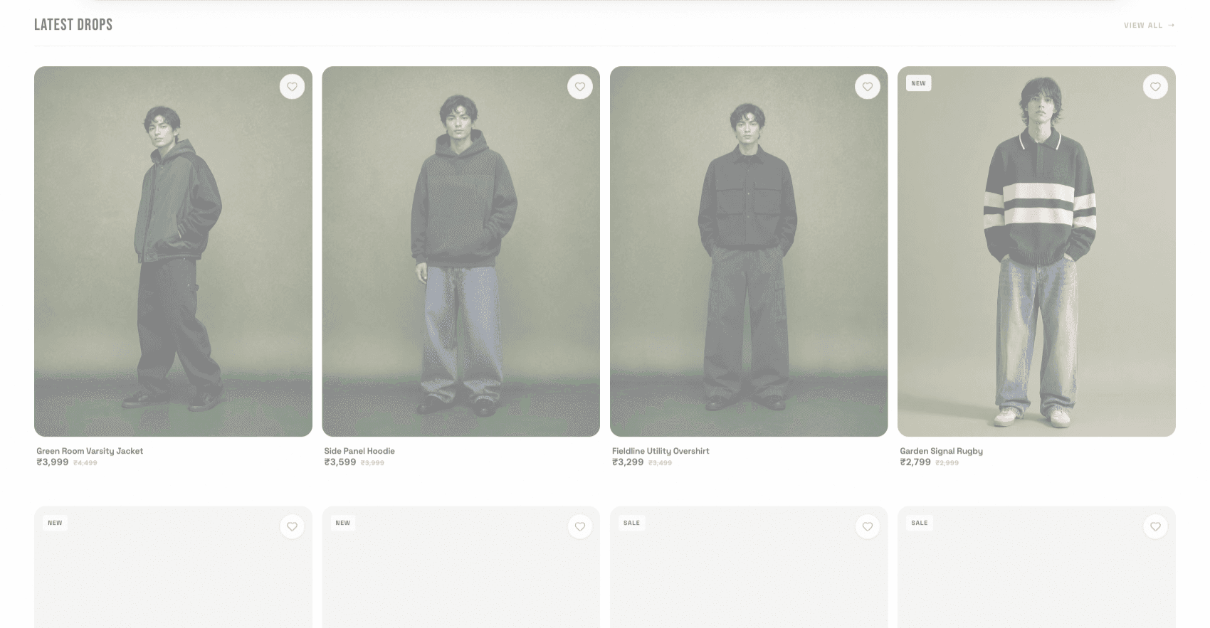
We carried the visual direction into the store, the product flow, and the tools that support each release.
Brand and art
Name, visual direction, campaign images, and graphics.
Product UX
Store pages, product flows, and a checkout path built for mobile.
Store build
A working storefront and the tools used to manage the catalogue.
Built to change with every drop.
The live store keeps the brand clear across new products, campaigns, and customer journeys.